The AI scientist in the loop
Two things happen in this part. We turn expression into radiation dose, which is the number a radiopharmaceutical is actually judged on. And we show who did the first version of that calculation, which was not a person.
Dose, at last
Everything in the previous part is expression. A radioligand or ADC does not deliver expression. For a radioligand, the relevant endpoint is absorbed energy, measured in grays, and how much arrives depends on things expression cannot tell you: how the drug escapes the blood vessels, how far it diffuses through tissue, how tightly it binds, how fast the cell swallows it, and how far the radiation travels after the atom decays.
We ran that simulation (Portrai Microscopic-PK) for the top three candidates plus both reference targets, on both tissue cores, with 7,400 MBq of Lu-177 and a physical half-life of 6.7 days. Lu-177 beta particles travel, so the dose in any square depends on its neighbours as well as itself.
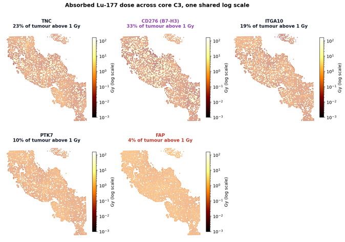
One shared colour scale across all five panels, logarithmic because the dose distribution spans five orders of magnitude. Both cores were simulated, and we report them separately rather than averaged, because the average hides a disagreement.
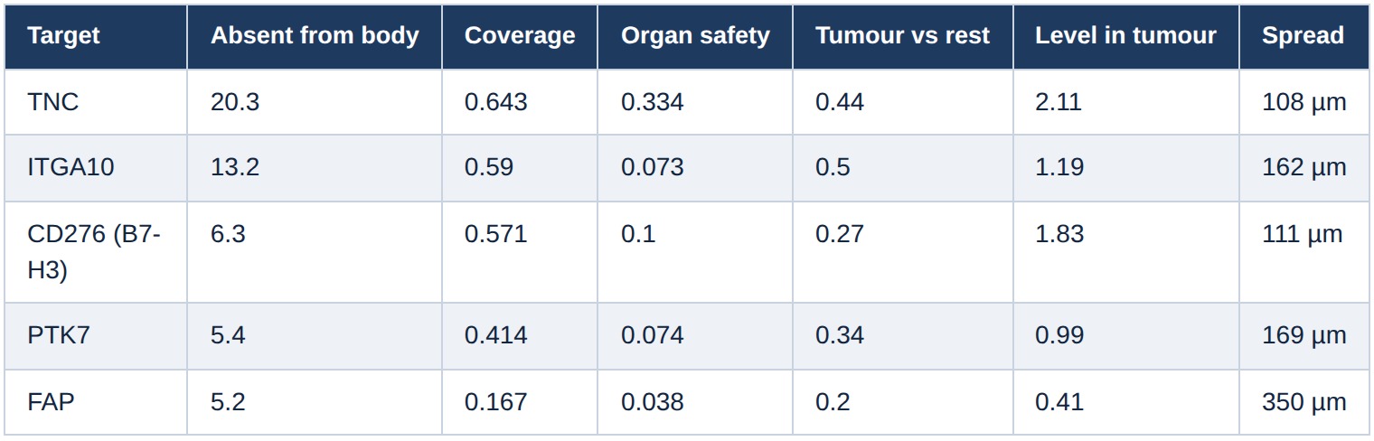
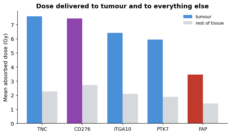
Two things in that table, in decreasing order of how much we believe them.
FAP is last on both cores, by both measures. Roughly half the mean dose of the leaders, and 3 to 13 times less of the tumour clearing 1 Gy. This is the one conclusion the two cores agree on completely, and it is the one that matters.
TNC and B7-H3 swap places between the two cores. TNC wins on B3, B7-H3 wins on C3, and neither margin is large. Two cores from one patient are not enough to separate the top two candidates, and we are not going to pretend otherwise by quoting the average. What survives is that both are clearly ahead of FAP, and ahead of ITGA10 and PTK7.
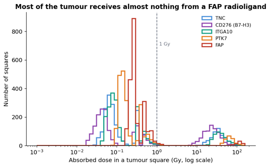
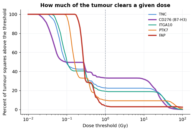
That second figure makes the mechanism visible. FAP actually delivers the highest median dose of the five, around 0.27 Gy against 0.05 to 0.16 for the others, and then falls off a cliff. The others deliver less to the typical square and far more to the squares that matter.
What is happening is that FAP's few positive squares are so far apart that their radiation smears out into a thin uniform wash instead of building up anywhere. Crossfire is adding dose from many distant weak sources rather than concentrating it. That is the direct consequence of the geometry in the previous section: the average gap from a dim square to a bright one was 350 micrometres for FAP and 111 for B7-H3, and a Lu-177 beta particle travels about 280.
A uniform 0.3 Gy wash does not kill a tumour. Concentrated dose does.
Two caveats on all of the above. The numbers are in grays but they are not calibrated: the model maps a normalised expression value onto a micromolar receptor concentration through a single scaling factor, so read 8 Gy as "about twice 3.5 Gy" and NOT as an ‘absolute’ clinical dose prediction. And the simulation runs 10 hours, which covers uptake and early clearance but not the multi-day tail of a real treatment cycle. The comparison between targets is the result. The absolute grays are not.
Who ran this first
The dose simulation above was not the first one performed on this patient. Six months before this study, someone typed a single line into this project's chat window:
@sid-T0-B3-D001 FAP targeting RPT, FAP-2286-based kinetic profiles
What came back was not a result. It was a proposal. Here is that exchange, still sitting in the application today.
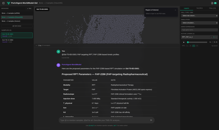
One line of input on the left, and a seventeen-row parameter table in reply. Look at what is in the third row of that table: Fibroblast Activation Protein (46/21,040 spots express). Before proposing anything the agent went and counted, and it put the count in the proposal where the person approving it would see it.
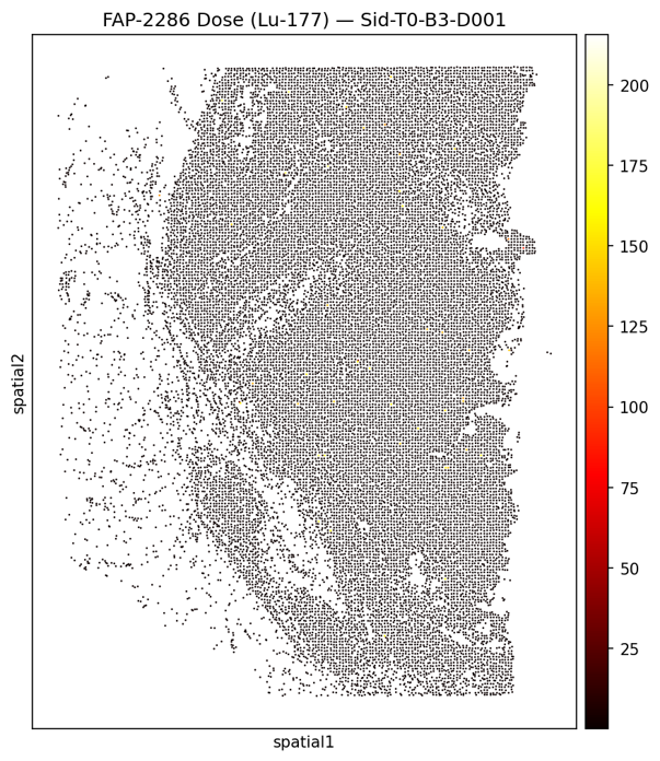
Almost entirely black: the dose is near zero nearly everywhere. It is the same conclusion this study reached by a completely different route.
What the agent actually did
The project database still holds the whole exchange: 3 sessions, 18 messages, and 98 recorded reasoning steps broken down as 41 iterations, 20 actions, 19 observations, 8 final answers, 6 plans and 4 explicit thoughts. 40 output files are registered against them.
The sequence for the FAP run went like this.
It looked at the data before proposing anything. Its first recorded observation:
Sample: Sid-T0-B3-D001 Spots: 21040,
Genes: 17644 FAP found!
Expression range: [0.000, 7.132], mean=0.011 Spots with FAP>0: 46 / 21040
Endothelial markers available: ['VWF', 'PECAM1', 'ENG', 'CDH5']
46 spots out of 21,040. It found the central fact of this whole series in its first tool call, and it found it because it checked whether the target existed before agreeing to simulate it.
It proposed parameters and justified each one. A seventeen-row table: Lu-177 because that is what FAP-2286 uses clinically, 7,400 MBq because that is a standard therapeutic activity, a dose point kernel for beta crossfire. And a clearance rate it argued for rather than defaulted to:
FAP-2286 is a peptide-based FAP inhibitor (not an antibody), so it has much faster clearance than antibody-based RPTs, hence
half_clear=0.5 h(vs ~10 h for antibodies).
That is the right distinction and it is not a lookup. It is the kind of thing a reviewer would ask about.
It stopped and waited. The message ended:
Please confirm these parameters, or tell me what to adjust.
A human typed Go, seven minutes later. Only then did it run anything, and when it was done it reported back into the same thread.
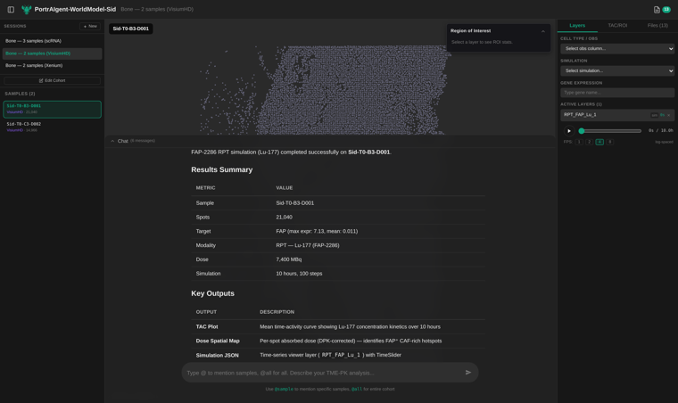
Sample, spot count, target with its expression range, isotope, dose, simulation length, then a list of what it wrote to disk. The last row of that list is the one the next section uses: a time-series viewer layer with a slider.
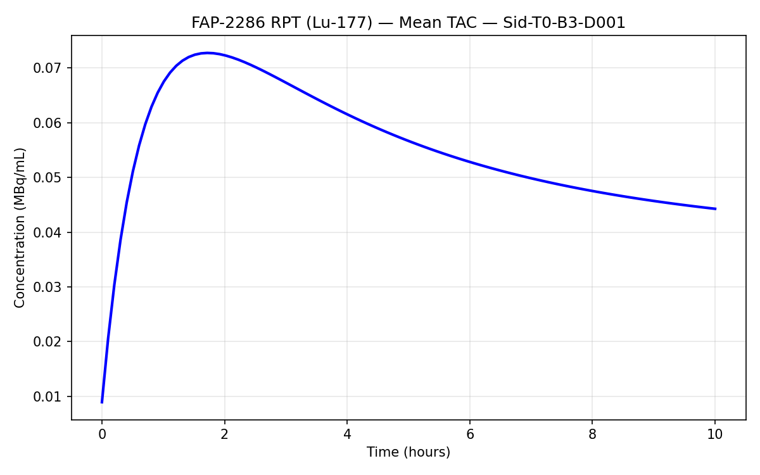
The simulation is not a picture, it is twenty of them
That curve is the whole tissue averaged into one line per timepoint. The simulation the agent saved keeps all 21,040 bins at all 20 timepoints, and the viewer will play it.
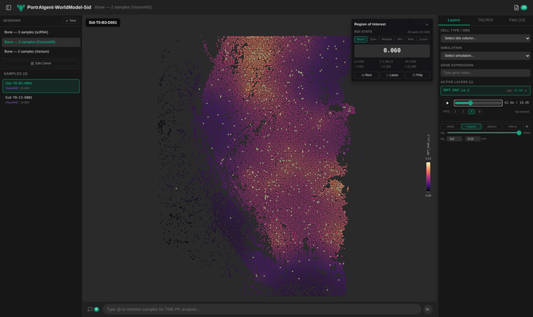
Same tissue, same colour scale, three positions of the time slider, and the viewer's own mean in the corner each time: 0.009, then 0.060, then 0.044 MBq/mL.
At the moment of injection almost nothing has arrived. What little has is a scatter of isolated bright bins, which are the ones sitting next to a vessel. Forty-three minutes later the drug is through most of the core, and it is through it unevenly: bright along the top edge and the right margin, dim in the middle. By ten hours it is washing out and the whole field has dimmed.
That middle panel is the useful one. A time-activity curve tells you the tissue average peaked and fell. It cannot tell you that the centre of the core saw less than the rim, and that is a question about whether a drug works.
This is what the word "world model" is doing in the project's name. The output is not a number for the tumour, it is a concentration at every point in the tissue at every moment, and the questions you can ask of it are geometric ones: did the drug reach the middle, how long did it stay, which parts never saw it.
The same agent, a different question
The FAP simulation was not the only thing it did. Asked to predict drug sensitivity, it produced per-cell maps across all three biopsies.
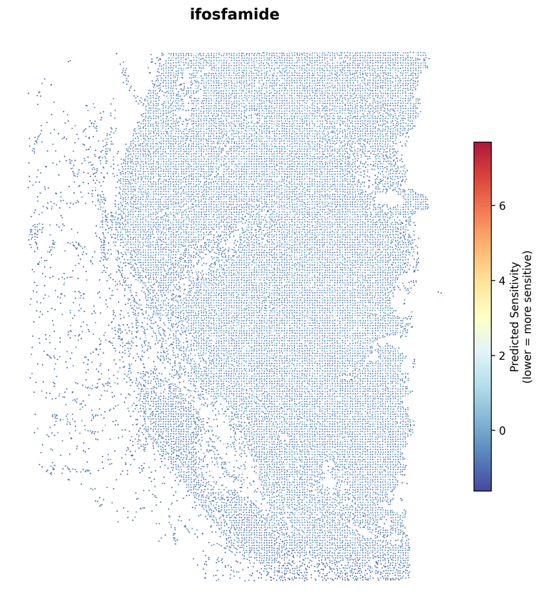
Each dot is a 32-micrometre square of the patient's tumour, coloured by predicted sensitivity to ifosfamide. And because it ran the same six drugs on all three timepoints, there is a trajectory.
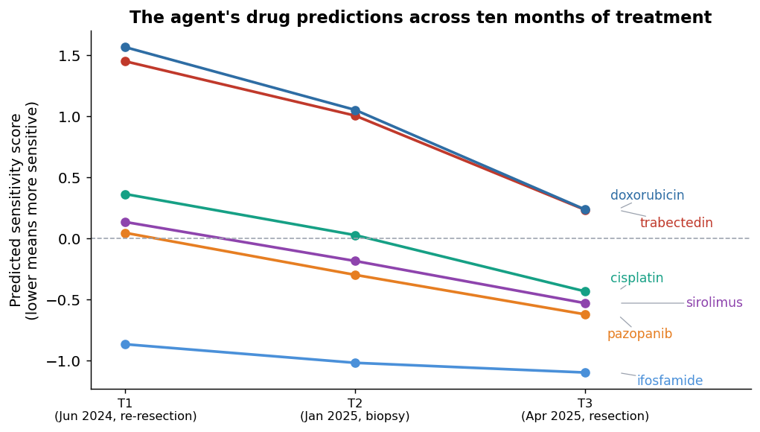
Lower means more predicted sensitivity. Every drug moves the same direction, and the ordering never changes: ifosfamide most sensitive at all three timepoints, doxorubicin least at all three.
Why any of this is agentic rather than automatic
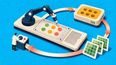
A pipeline is a fixed sequence. This study was not one, and the record shows where the judgement calls were.
The tumour signature had to be learned from the patient rather than taken from literature, because collagen markers merge osteosarcoma cells with fibroblasts and blood vessels, which are exactly the populations that had to stay separate. The mask over the tissue had to be spatially smoothed, because thresholding a 64-micrometre square at 530 counts follows sampling noise rather than tissue. Cancer cells had to be downsampled to a common depth, because June was sequenced a third as deeply as January and raw coverage would have measured the sequencer. The surface filter had to be inverted from exclusion to inclusion, because otherwise the short list was long non-coding RNAs. The organ-comparison axis had to be dropped, because one target produced a fold change of 314 million by dividing by nearly zero.
None of those were in the plan at the start. Each was found by looking at an intermediate result, noticing it was wrong, and understanding why. That is what the work consists of, and it is why the transcripts are published alongside the tables.
Where this leaves the patient
Ranked first through fourth on eight measurements, then confirmed by a dose calculation: TNC, ITGA10 and B7-H3. Of the three, B7-H3 already has an antibody drug conjugate in phase 2 trials in sarcoma, which makes it the one that could be acted on soonest. ITGA10 came out of the patient's own data with no prior instruction, and turns out to have a body of preclinical work behind it arguing for exactly this use.
Ranked 85th of 87: TROP2, the target of two approved drugs, on 0.2% of this person's cancer cells.
That gap is the argument for doing this at all. Not that the software found something new, though it did, but that the same eight measurements applied to one person's tissue can tell you which of the field's existing drugs would have been aimed at nothing.
What we would do next
More things, in order.
Confirm the top three at protein level. RNA is not protein. Sitting unused in this project's raw data is a multiplexed proteomics measurement of the same two cores, plus stained images of the same sections. That check is available and was not done here.
Re-quantify the protocadherin locus properly. Nine of the 29 discovered targets sit in one tightly packed genomic region where reads are easily misassigned. They score well and we do not believe them.
Which drug would work, and how you would check
The first parts asked what to build a drug against. This one asks a nearer question: of the drugs that already exist, which would this patient's tumour respond to.
It is also the part where we stop showing you figures we drew and start showing you the tool. Every number below was pulled out of the running application over its own web interface, and every screenshot is that application in a browser with this patient's data loaded.
The result first
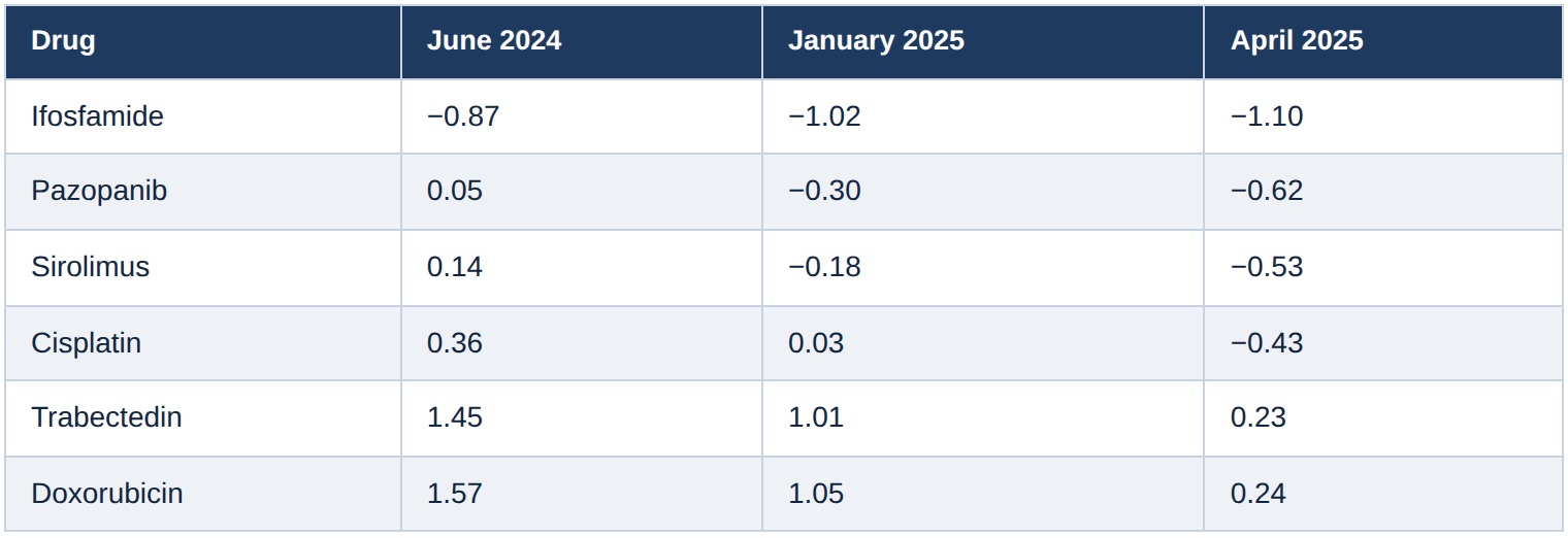
Six chemotherapy and targeted agents, predicted per cell, at three biopsies across ten months.
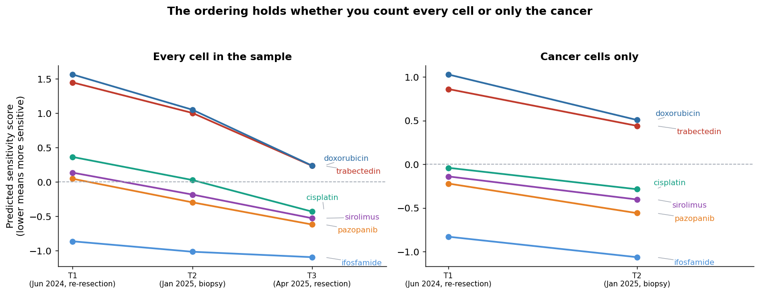
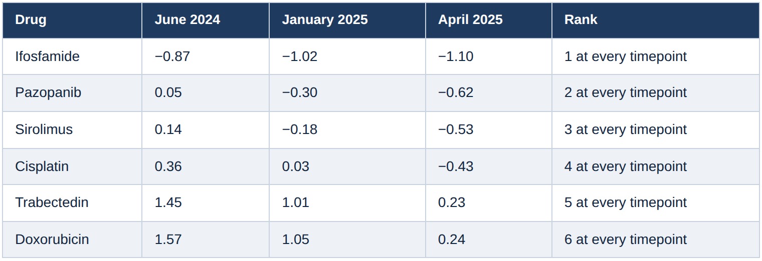
Lower means more sensitive. Four things fall out of that table.
Ifosfamide is first at all three timepoints. It is the only drug with a negative score in June, and it stays the most sensitive agent through to April. Its score deepens from −0.87 to −1.10.
Pazopanib is consistently among the strongest. It starts marginal, at +0.05 in June, and is clearly negative by January and April. Second place at every timepoint.
Sirolimus tracks just behind it. Third at every timepoint, on the same trajectory.
Doxorubicin and trabectedin are last, and they are last by a wide margin. Both sit above +1.4 in June, and even in April, when every drug has moved down, they are the only two still on the resistant side of zero.
The ordering never changes. Not once, across three samples taken ten months apart and prepared separately.
The obvious objection, and the test for it
We showed that the cell population in these biopsies changes drastically: 21% cancer in June, 17% in January, 1% in April, with T cells going from a fifth of the sample to 86%. A score averaged over every cell in a sample that is changing that much may be measuring the change in composition rather than anything about the drug.
So we recomputed the whole thing inside the cancer compartment alone, using the cell-type labels the application serves alongside the scores.
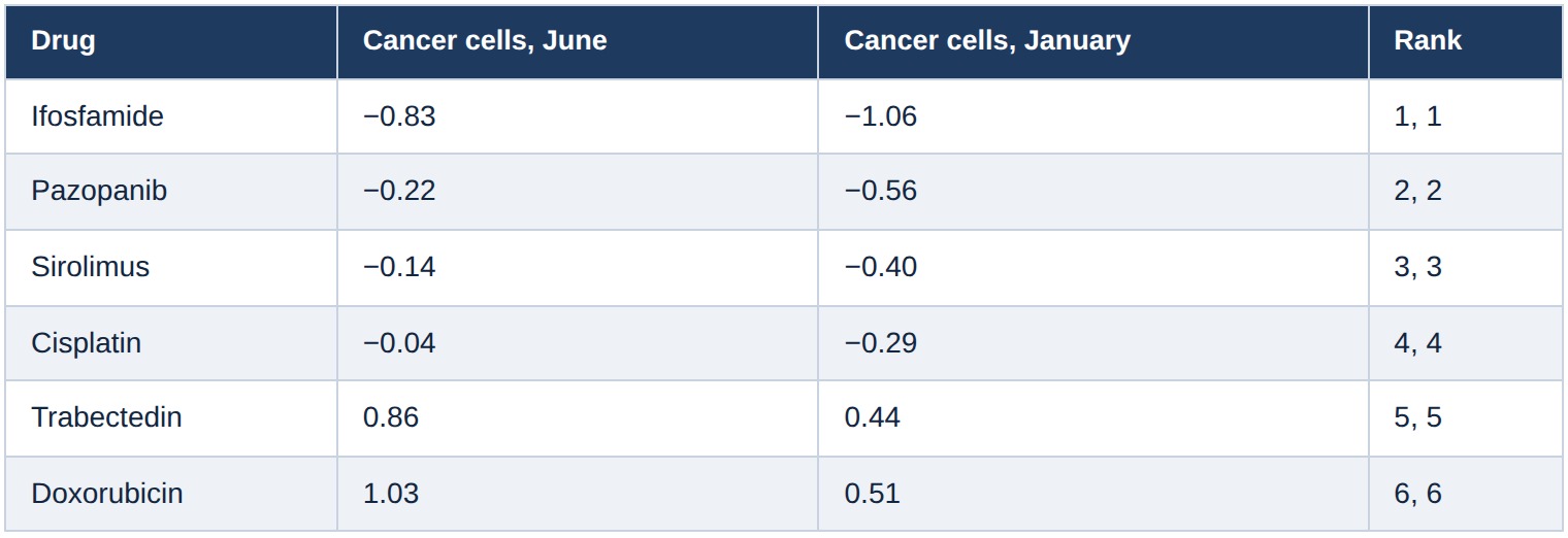
The ranking is identical. Same six drugs, same order, whether you average over every cell in the sample or only over the cancer cells. The ordering is not an artefact of the shifting cell mix.
The absolute level is. Restricting to cancer cells pulls every drug down: cisplatin goes from +0.36 to −0.04 in June, because the immune cells that dominate the sample are scored as more resistant than the cancer is. So the level of the all-cells score depends on what else is in the tube, and the ordering does not.
The downward drift over time survives the test only partly. Between June and January the drift is about the same size inside the cancer compartment as it is overall, so that much looks real. April cannot be checked, because the application does not serve cell-type labels for that sample and it contains too few cancer cells to test anyway.
Now the tool
Everything above came out of the application's own interface. Here is what that looks like.
Three stored sessions, one per data type: the three single-cell biopsies, the two Visium HD slides, the two Xenium slides. Opening a session shows what has been produced in it.
Twenty-seven artifacts in the single-cell session: eighteen sensitivity maps, three summary tables, three working data files, three others. None of these were made for this write-up.
The request that produced them, and the answer, are still in the thread.
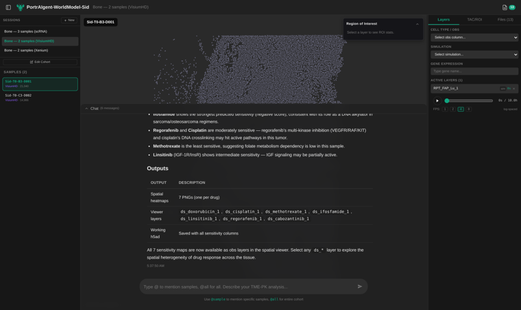
Note what it lists under Outputs: seven spatial heatmaps, seven ds_* viewer layers, and a working file with the columns saved. Those layers are exactly what the rest of this post switches on.
Loading a sample draws every cell.
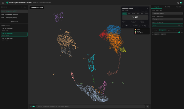
13,045 cells from the January biopsy, coloured by the cell type each was assigned. Now switch the colour to a drug.
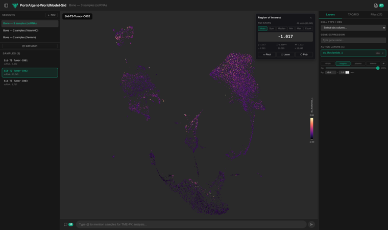
This is the map the section title promised: every one of those 13,045 cells coloured by its own predicted ifosfamide sensitivity, live in the browser. Dark is sensitive. Almost the whole map is dark.
The panel at the top right is worth a moment. It reads −1.017, computed over all 13,045 cells by the viewer at the moment the screenshot was taken. That is the same number as the January row of the ifosfamide table above, and the same number the agent reported in April. Three independent paths to one value.
Switch to doxorubicin, same cells, same colour range.
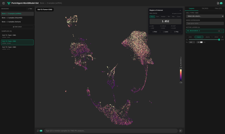
+1.052, and the map is bright almost everywhere. This is the contrast in the first table, drawn one cell at a time rather than summarised into a number.
What this is and what it is not
These are predictions from a model that reads a cell's expression profile and a molecule's structure, and returns a number. It has never seen this patient. It has no access to the clinical record, and we have not compared any of it against what actually happened to this person, because that is not our data to use.
So the honest statement of the result is narrow. Within this model, applied to this patient's cells, the ordering of these six drugs is stable across ten months, across three separately prepared samples, and across every cell compartment in the tumour.
A note on limitations
The sensitivity results should be read as a demonstration of what this framework can do, not as a validated clinical prediction. Models of this kind still require broad external validation across tumour types, treatment settings and independent patient cohorts, as well as prospective comparison with real treatment response. For now, their value here is explanatory: they show how patient-specific molecular data can be turned into testable drug hypotheses, not which treatment a patient should receive.
Related video
Related Links
This case study is for research and exploratory purposes only. The results have not been clinically validated and should not be used to guide patient care.